All Case Studies
Design TalentXchange • with Wilma Huertas
TalentXchange
A ground-up brand identity, including the wordmark, color system, and a geometric shape language, built to make TalentXchange's new staffing platform feel established from day one.
The Challenge
Launching a new platform inside an established industry is a credibility problem before it's a design problem. TalentXchange needed to feel like it had been in the market for years: trustworthy enough for candidates to hand over their careers to, and established enough for client companies to bet their hiring on, despite being brand new. A generic "startup" look would undercut that trust before a single conversation happened. The identity needed to project stability and confidence from the very first impression: the logo, the LinkedIn header, the first deck a prospective client opened.
Our Approach
I built the identity around a single simple move: an unmistakable wordmark and a color and shape system versatile enough to carry it everywhere the brand needed to show up.
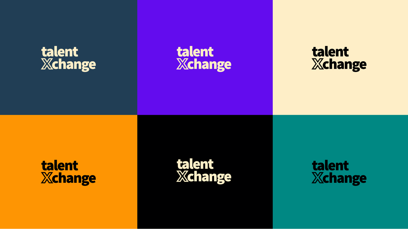
The wordmark stacks "talent" over "Xchange," with the capital X doing double duty: it's the visual anchor of the mark and a literal nod to the exchange at the center of the business. From there, I developed a bold, saturated palette (deep navy, violet, warm cream, and a high-energy orange, with teal and black as supporting players) that reads as confident rather than corporate-safe, a deliberate departure from the muted, interchangeable palettes that dominate staffing and recruiting brands.
Around that core, I built a geometric shape language (circles, arcs, dot grids, diamonds, capsule forms) that gives the brand room to flex across formats without ever feeling improvised. The same shapes that split a LinkedIn header on a diagonal also structure a company profile deck, so every touchpoint feels like it belongs to the same system, whether it's a recruiter's social banner or a boardroom pitch.
I explored multiple directions before landing on this system, and stress-tested the wordmark across a full color range to confirm it held up on any background before finalizing the palette.
The Solution
The finished system gave TalentXchange a full identity toolkit: a logo tested across its color range, a distinct shape language, and ready-to-use templates (LinkedIn headers, company profile decks) that let the team produce new brand-consistent materials without needing design support for every asset. The result reads as an established company, not a startup finding its footing, which is exactly the credibility problem the identity needed to solve.
Project Details
- Client
- TalentXchange
- Lead
- Wilma Huertas
- Service
- Design
Image viewer
Next Case Study
HBR Spark
Harvard Business Publishing