
Back to Portfolio
Design Reliant Life Sciences • with Wilma Huertas
Reliant Life Sciences
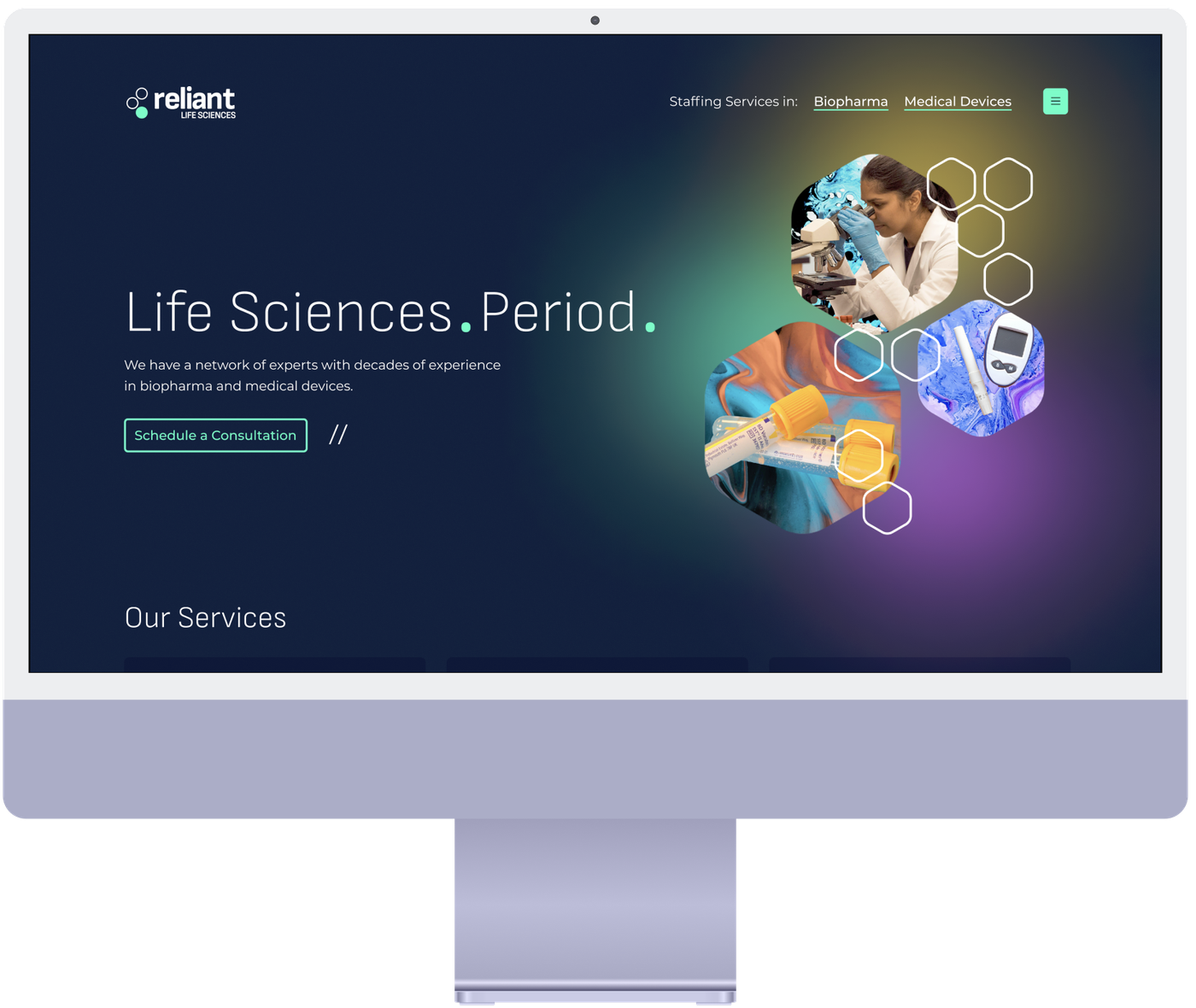
As Lead Designer at Lakeshore Studios, I created the complete brand identity for Reliant Life Sciences by building a bold, modern visual system that cuts through industry branding.
Key Results
Complete
End-to-end brand system delivered
1
Cohesive visual identity built from zero, differentiating Reliant in a saturated consulting market
5+
Branded touchpoints designed — website, business cards, presentation templates, email signatures, and social assets
The Challenge
The life sciences consulting industry was saturated with conservative, predictable brands — sterile blues, molecular imagery, and corporate typography that all blended together. For a newer firm like Reliant, this homogeneity created three compounding challenges: the need to instantly communicate credibility against established competitors, the difficulty of making highly technical services feel accessible, and the imperative to humanize a sector dominated by bureaucratic language — reminding audiences that behind every regulation is a patient waiting for treatment.
Our Approach
The strategy was anchored around a single positioning concept: "Life Sciences. Period." — a declaration of unwavering focus and expertise that gave the visual system a clear north star.
I led the full brand creation process from strategy through execution. I began with stakeholder interviews to define Reliant's unique value proposition and competitive positioning, then designed a complete visual identity system — logomark, typography, color palette, and graphic patterns — built to work cohesively across every touchpoint. I also created the information architecture, wireframes, and high-fidelity designs for the full responsive website, partnering with developers to bring it to life. The engagement concluded with a comprehensive suite of marketing collateral and documented brand guidelines to ensure long-term brand integrity.
The Solution
The resulting brand identity deliberately breaks from life sciences conventions while maintaining sector credibility. The logomark features interconnected circular forms suggesting both molecular innovation and collaborative partnership, paired with clean sans-serif typography that communicates approachability without sacrificing professionalism.
Rather than defaulting to healthcare blues, the color palette layers deep navy (expertise), vibrant teal (innovation), and strategic gradients that evoke the journey from laboratory to patient. A flexible hexagonal pattern system — inspired by both molecular structures and regulatory flowcharts — ties it together, providing visual interest and brand recognition across all applications.
Project Details
- Client
- Reliant Life Sciences
- Lead
- Wilma Huertas
- Service
- Design
Go deeper
Behind the Work
Image viewer
Next Case Study
Fusion Cell
Fusion Cell